- iPython Notebooks
- Todos
- Visualization articles and essays
- The problems of computers and graphics (via Tufte)
This week we're going to be learning visualization using Python libraries. These libraries are…pretty difficult. Which should raise the question: why are we learning them? Programmatic visualization is no different than any kind of programmatic task (such as downloading a webpage, copying parts of the page by hand): it will always be far, far slower to do it via programming. So the point is to pick things that are highly repetitive and difficult to manually break down. In the visualizations we'll look at, we'll see how crowded/messy visualizations can be improved once we can filter the noise.
iPython Notebooks
- Basic plotting with Matplotlib
- Overview of Pandas, Series, and DataFrames
- Apple stock
- Stanford Tuition
- When is Cheryl's birthday?
- A gallery of interesting iPython notebooks
- A short demo on how to use IPython Notebook as a research notebook - Randal S. Olson (randalolson.com)
How to use iPython notebooks
Go to your terminal and type:
ipython notebook
A web-browser window should pop-up, and you can do everything from there.
To re-use other people's notebooks:
Find where they exist as a URL, e.g.
http://norvig.com/ipython/Cheryl.ipynb
Prepend: nbviewer.ipython.org/url/
eg:
http://nbviewer.ipython.org/url/norvig.com/ipython/Cheryl.ipynb
The interactive page should have a Download option. You can download the ipynb file on to your computer, and then run it from your own iPython notebook instance (i.e. when you run ipython notebook in the terminal).
Todos
- Figure out how to make a very simple chart with matplotlib. You should be able to do it as a standalone-script or in iPython.
- Read all of the visualization essays and do some thinking
- New homework: USAJobs Midterm Part 2
- And remember the homework due today: USAJobs Midterm Part 1
- Check out what Stanford tuition hikes look like
Visualization articles and essays
Please read these by Wednesday:
Edward Tufte forum: Chartjunk (edwardtufte.com) - Great examples of the design of charts and tables, both good and bad.
The Upshot Is One Year Old. Here Are the Stories You Clicked the Most. (nytimes.com)
Edward Tufte forum: Megan Jaegerman's brilliant news graphics (edwardtufte.com)
Tidy Data by Hadley Wickham - this isn't about visualizations, but about how data needs to be structured in order for it to be easily turned into visualizations.
More about Tufte
The Information Sage by Joshua Yaffa (washingtonmonthly.com)
Homework from Edward Tufte , Ten Miles Square , The Washington Monthly (washingtonmonthly.com)
The problems of computers and graphics (via Tufte)
via Edward Tufte'd discussion on Chartjunk:
Moire effects have proliferated with computer graphics (in programs such as Excel). Such unfortunate patterns were once generated by means of thin plastic transfer sheets; now the computer produces instant chartjunk. Shown here are a few of the many vibrating possibilities…
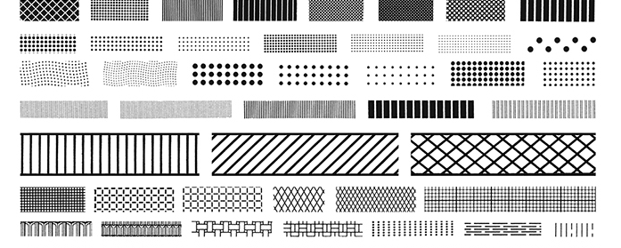
This form of chartjunk is a twentieth-century innovation, and computer graphics are multiplying it more than ever. The handbooks and textbooks of statistical graphics, along with user's manuals for computer graphics programs, are filled up with vibrating graphics, presented as exemplares of design.
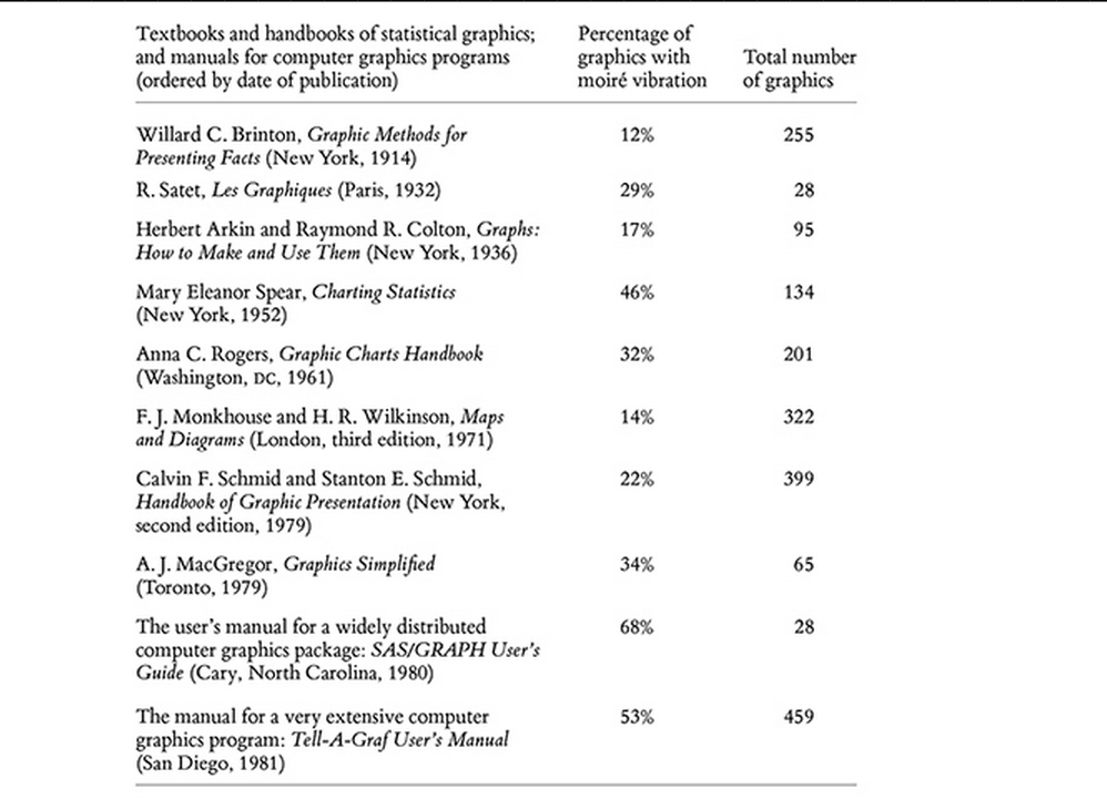
Note the high proportion of chartjunky graphics in the more recent publications. Computer graphics are particularly active:
Occasionally, designers can seem to seek credit merely for possessing a new technology, rather than using it to make better designs. Computers and their affiliated apparatus can do powerful things graphically, in part by turning out the hundreds of plots necessary for good data analysis. But at least a few computer graphics only evoke the response "Isn't it remarkable that the computer can be programmed to draw like that?" instead of "My, what interesting data."
Another chartjunk example from Tufte:
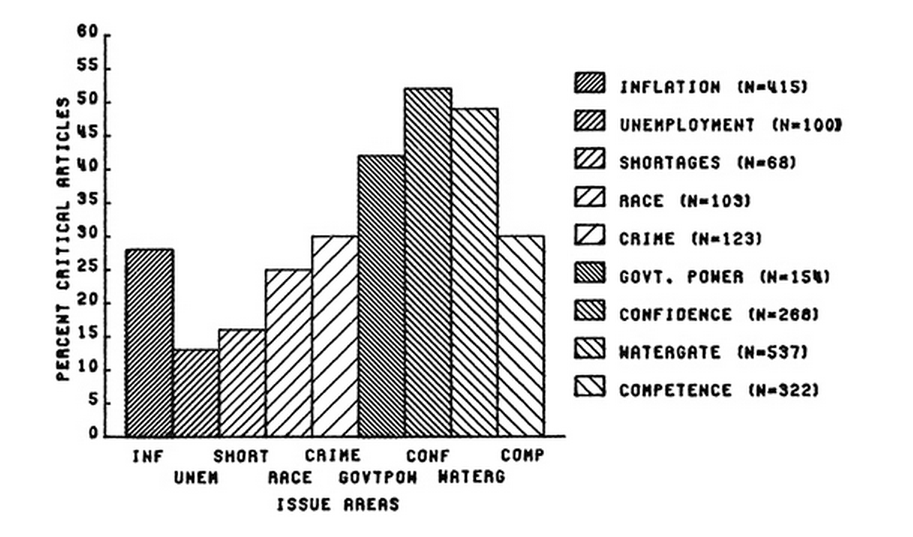
Note that the issue here is not just the bad moiré, but that there are so many categories that the x-axis is unusable, requiring the reader to use the just as horrible label. Good visualization is just as much about editing as it is about design.
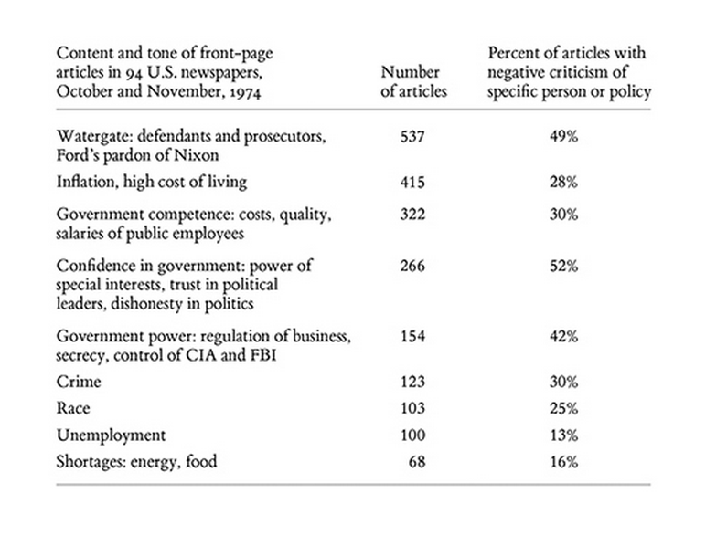
Tufte points out that a table would've done just fine:
The overly busy vertical scaling shows more percentage markers and labels than there are actual data points. The observed values of the percentages should be printed instead. Since the information consists of a few numbers and a good many words, it is best to pass up the computerized graphics capability this time and tell the story with a table:
Tables are awesome!
They're easy to read and easy to follow. And for our purposes, they're very easy to make via programming or other tool (such as Google Charts).